Project 6: Dictionaries, Drawing and While -
A Review
Due: Sunday
Nov 23rd at 11:59pm
Summary:
In this project you will review dictionaries, while loops and dearpyGUI
Details:
For this project we will use the same starting files as last time
- Before beginning, make sure you have the newest dearpygui installed.
The one from last summer had a bug when closing the window (it
wouldn't close it properly till the program ended)
- then get the same the initial files,
from last time Project5Start.zip contains two python files and
another folder with several excel files in them, these files are
downloaded from the bureau of labor statistics (though the one with
salaries has had most of its rows removed to make it smaller. All
remaining data is for tech related professions in Massachusetts)
- put this zip file in the folder you want to work, for example your
PycharmProjects folder.
- extract/unzip the file
- now rename the Project5Start to include your name
and an indication that this is project6-
for example I might use Project6Jsantore
- Open the project in pycharm
- install the openpyxl library the same way we previously installed
the dearpygui library
- As before, open the main.py file. This is where you will do your
work.
- currently this file imports the comp151 helpers file and uses that
file to read information into the data variable. Continue your
project from here
import Project5Helpers

data = Project5Helpers.get_job_data()
- the data variable is a list of dictionaries. It has the format below
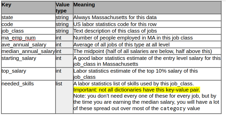
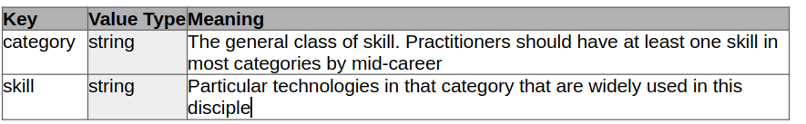
- for those job_data dictionaries that have the needed_skill key, it is a list of dictionaries that are in the following form
- First ask the user what salary they want to earn 5 years after graduation and store that in a variable
- Then Begin the main program by looping forever and presenting your user with command line menu of the sorts that we have covered in class.
- give your users the following options
- quit
- Do just that, exit the program
- See Starting Salaries
- If the user chooses this item, then pop up a dear pygui window showing a bar graph like you made in project 4 with X and Y axis. The Y axis should be salary and should show salaries
- Draw a bar for each job that has a needed_skills key in the dictionary (and only those that have the needed skills key!).
- the height of the bar should be the starting salary
- If the starting salary is above the users desired 5-year after graduation salary draw the bar in green, otherwise draw it in blue
- below the bar draw the name of the job (it can be the government job_class or the more readable version from project5, your choice.
- See Median Salaries
- If the user chooses this item, then pop up a dear pygui window showing a bar graph
like you made in project 4 with X and Y axis. The Y axis should be
salary and should show salaries.
- Draw a bar for each job that has a needed_skills key in the dictionary (and only those that have the needed skills key!).
- the height of the bar should be the median salary
- If the median salary is above the users desired 5-year after graduation salary draw the bar in purple, otherwise draw it in red
- below the bar draw the name of the job (it can be the government
job_class or the more readable version from project5, your choice.)
- See How many jobs
- If the user chooses this item, then pop up a dear pygui window showing a bar graph
like you made in project 4 with X and Y axis. The Y axis should be number of jobs and should show jobs numbers by thousands.
- Draw a bar for each job that has a needed_skills key in the dictionary (and only those that have the needed skills key!).
- the height of the bar should be the number of jobs in Massachusetts
- If the median salary is above the users desired 5-year after graduation salary draw the bar in salmon, otherwise draw it in orange
- note that we are displaying bar height based on number of jobs, but bar color still based on salary
- below the bar draw the name of the job (it can be the government
job_class or the more readable version from project5, your choice.)
- See other/odd jobs
- If the user chooses this option, then pop up a dear pygui window showing a bar graph
like you made in project 4 with X and Y axis. The Y axis should be number of jobs and should show jobs numbers by thousands.
- Draw a bar for each job that does not have a needed_skills key. (only included individual jobs - do not include the summary job entries [those with an code ending in four zeros '0000'])
- the height of the bar should be the number of jobs in Massachusetts
- If
the median salary is above the users desired 5-year after graduation
salary draw the bar in salmon, otherwise draw it in orange
- note that we are displaying bar height based on number of jobs, but bar color still based on salary
- below the bar draw the name of the job (it can be the government job_class or the more readable version from project5, your choice.)
- See Job Growth Potential
- if the chooses this option, then pop up a dear pygui window showing a bar graph
like you made in project 4 with X and Y axis. The Y axis should be salary
- Draw a bar for each job that has a needed_skills key in the dictionary (and only those that have the needed skills key!).
- the height of the bar should be the difference between the starting salary and the top salary (the salary that the best practitioners can get in this field usually in their 40s and 50s).
- With the following exceptions,
- the network support specialists starting salary should be compared to the Network architect's top salary
- The database administrators starting salary should be compared to the database architect's top salary
- The color of the bars should be as follows, if the top salary is at least twice the starting salary draw the bar in lime otherwise draw it in olive
- See Jobs with a few highly paid individuals
- if the user chooses this option, pop up a dear py gui window and draw in large text the jobs that have an average salary more than 5% higher than the median salary (your did this calculation in your previous project). These jobs are great if you are the best of the best.
- For every Graph that you bring up - be sure to draw a title using draw_text that is large enough to be easily seen and tells the user what they are looking at. (the window titles are not enough)
Of course put this into git and onto github sooner rather than later.
Additional requirements:
Your code must be commented. you don't have to comment every line, but you
need to explain to me what you are doing in the code.
Submission:
As with the previous project, to submit
the project to me, share it with me on github. My github id is jsantore.
You can see directions for doing this here.